After a year since designing my board game Knights Arena: Mid Galcious I decided to come back to the design. Having play tested it a hand full of times and come away each time with a lot of notes and improvements upon the rule set and some of the mechanics; I had sufficient information to go back and re-design the board game. Further more I looked back at the design of the textures, as well as the cards themselves and decided I could do better, or they could be re-designed in such a way that made them more coherent.
Firstly that needed to be changed, and how it needs to be seen in the rule book. After the notes were together and I knew in my head what I wanted to do with the rules I moved onto the design and look of the board game itself where I felt it most needed a change.
Secondly I created a new game company and logo, and really re-designed my whole game company image from Black Game Studios™ to White Horizon Games™. I felt like I needed a change, a new horizon if I may, and then ideas rushed through my mind and I ended up with White Horizon Games™ along with a good logo that fitted many things to come I hope.
New Company Logo.
The paper texture I used was taken from a DeviantArt user who allowed me to use that single texture for the use of University purposes. Since then I decided I would like to sell the board game to the wide people of the world, for obvious reasons, I put a lot of effort into the creation and production of the board game, and I feel it is something different within the board game world.
So first thing I thing changed was the box wrap, paper texture replaced with a solid black colour complementing the Yin and Yang of the 2 Factions within Knights Arena: Mid Galcious. I also added the new company logo to the box wrap, as well as re-designed the Knights Arena: Mid Galcious logo a little so it looked more pleasing, simple and effective will always be something I go to.
From there I changed the Decks, from Attack, Defense, Skill, Event and Character Decks each changing in varying differences and ways from the others and having a better outcome I think than the previous versions.
Starting at the beginning I did the Card Backs for the cards, I again got rid of the paper texture and changed it to a solid black and a solid white colour. Again putting forward the Yin & Yang format of this edition of Knights Arena.
The all round Knights Arena card back, the one that would be used for the Attack, Defense, Skill and Events cards was done quickly and efficiently, not complex but simple and effective. The Black Knights card back again simple just with the solid black background. The White Knights card back would have been simple, just a solid white background and the logo, however I didn’t like the logo the White Knights used so decided to change the logo.
Old Knights Arena Card Back.
New Knights Arena Card Back.
Old Black Knights Card Back.
New Black Knights Card Back.
The White Knights are the opposite of the Black Knights in every sense of the word, like meeting yourself from a parallel universe. The Black Knights region ruled like a merchant country, with mercenary types, hard headed types and tight fisted types all over. Corruption present but maintains a decent level of society to all who knew the gift of coin making or know how to wield a sword or shield.
The White Knights region however ruled justly by the religion they held close in whatever they do, they still hold a military as does the Black Knights but they do things to keep the peace and maintain tranquility not allowing free trade by other but only by the Kingdom.
Thus meant that using a shield as their logo did not fit all that well, but the symbol of their religion the Galcious Gate would. So I designed a new logo around the Galcious Gate, a absolutely huge universe gate seen from miles upon miles and the only remaining intact relic from the old civilization dubbed Galcious.
Knowing this I came to researching something huge, grand and religious like that would burn an image into a people that grew into a powerful Kingdom. What I found and then designed fitted the White Knights perfectly and I was happy with the final design of the logo.
Old White Knights Card Back.
New White Knights Card Back.
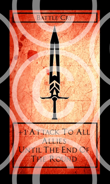
After those were done I moved onto the front of the cards, I started at the Attack deck which also included Event cards that are within that deck. Paper texture removed, solid red colour added, the outcome was something I did not expect, it held a certain professional quality as well as simplistic design that board games are well known for, worthless to say I was happy at the results and moved forward with the same type of design for the Attack deck.
Old Attack Deck Card Design.
New Attack Deck Card Design.
Next on the list was the Event card fronts, previously I had settled with a broken glass texture to signify a Galcious Rift, which much like a rip in space time opens up to another world/universe/timeline than the current plane. It fitted for what I needed back then but I never much liked the texture of the glass, it didn’t seem what a Galcious Rift would be, nor what people would symbolize them to be.
So I thought long and hard on what the people would signify as the symbol for a Galcious Rift and easily recognise. From there I went and researched: time rifts, space rifts, space time rifts, symbology from symbols of chaos to other symbols. The one that caught me was the symbol of chaos, people of Galcious (the world which both Black & White Knights inhabit) would see a symbol of chaos and think Galcious Rifts considering they bring destruction to towns, villages and cities, and are unpredictable to pin point.
The reason why this would be fitting is because Galcious Rifts bring The Fallen, long since dead human knights who are controlled by chaos and dread, the leaders of The Fallen are Archbeings, only seen a few times and control the minds and actions of The Fallen and the much larger beings named Titans, huge monstrous mysterious beings the size of a mountain varying in size to what they are meant for.
Both are formidable, and outside the in-fighting of the Kingdoms across the world of Galcious are the single most threat to people and the peace of the land. So a symbol of chaos would be very fitting indeed to use for the Event cards which depict such anarchy and destruction upon you and your opponent.
Old Event Card Design.
New Event Card Design.
Moving on from Event cards, it was onto the Defense Deck, this one was simple and straight forward, take off the paper texture and add a solid blue colour and we are done, the results are the same of the Assault Deck, simple and effective.
Old Defense Deck Card Design.
New Defense Deck Card Design.
After the Defense Deck, it was onto the Skill Deck, again a simple fix of the paper texture to a solid green colour, tweaks here and there for the design, straight forward and gives the same simple results that I decided fitted the baord game very well now.
Old Skill Deck Card Design.
New Skill Deck Card Design.
All of the Decks now finished along with their Event card counter parts it was time to move onto the Character/Faction Decks and Cards. These would be also straight forward as they only needed the same solid black and white colour as their card fronts. The results are similar to the card fronts, simple and I also made adjustments to the cards so they were easier to read and any mistakes I had previously made.
Old Black Knights Character/Faction Card Design.
New Black Knights Character/Faction Card Design.
Old White Knights Character/Faction Card Design.
New White Knights Character/Faction Card Design.
Not much changed in the Character/Faction Cards but the layout of the Skill Moves text changed from middle alignment to left alignment. Other than that the colour is the only difference without the paper texture and they look just fine, better I’d say actually.
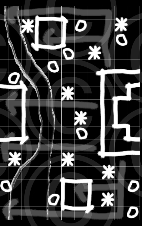
Now it was onto the Battlefield Mats, AKA the “boards” quote-on-quote that the board game and players would be playing on and strategising . Again I used the paper texture, and this is the big reason why I wanted to get rid of it, as well as for the Box Wrap, because the resolution was BAD.
So I went through the Battlefield Mats, got rid of the awful low resolution paper texture and changed it for a solid black with the rest of the colours being a solid white. The river/water however I decided to stroke with solid white rather than have it a solid white, the results were good so I went and changed it to that.
I also decided to create another 2 Battlefield Mats because when I designed the board game I wanted 6 but did 4 because of time constraints. Having 6 means more random Battlefields Mats to play on and more tactics to come out from the differences between them, as well as advantages and disadvantages for either faction.
Old Battlefield Mat Designs.
New Battlefield Mat Designs.
Now that all the design changes are done it’s time to move onto that stack of play testing notes that I collaborated, as well as change the design of the rule set and add in the changes that are needed to make the mechanics and overall play of the board game better.


